
Key Takeaways:
- Cohort Analysis Focuses on Behavioral Trends Over Time: Instead of analyzing all users together, cohort analysis groups users by shared characteristics—such as signup date—and tracks their behavior across specific time periods to reveal meaningful patterns.
- It Provides Deeper Insight Than Traditional Analytics: Total revenue or total users may show growth, but cohort analysis reveals whether that growth is sustainable by examining retention and engagement across different groups.
- Retention Is the Most Critical Indicator: Retention analysis shows how well a product or service keeps users engaged after acquisition. Strong retention usually indicates product-market fit and long-term viability.
- Churn Analysis Helps Identify Weak Points: By tracking when users drop off, businesses can pinpoint onboarding issues, pricing concerns, or feature gaps that may be affecting user satisfaction.
- Cohort Tables Make Patterns Easy to Visualize: Organizing cohorts by rows and time intervals by columns allows businesses to quickly identify performance improvements, declines, or consistent trends over time.
- Revenue Cohorts Improve Customer Lifetime Value Understanding: Analyzing revenue by cohort reveals which customer groups generate the highest long-term value, helping optimize marketing spend and acquisition strategies.
- Excel Enables Manual Implementation: Even without advanced analytics tools, cohort analysis can be performed using structured spreadsheets, pivot tables, and organized date tracking.
- Google Analytics (GA4) Automates Cohort Reporting: GA4 provides built-in cohort exploration features, allowing businesses to measure user retention and monetization trends with visual dashboards.
- It Supports Smarter Marketing Decisions: Cohort analysis helps evaluate campaign performance, acquisition channel quality, and long-term engagement—making it valuable for strategic planning.
- Cohort Analysis Drives Sustainable Growth: By focusing on user behavior after acquisition rather than just new signups, businesses can build stronger retention strategies and increase long-term profitability.
In the modern data-driven business landscape, understanding customer behavior is no longer optional — it is essential. While traditional analytics tells you what is happening, cohort analysis tells you why it is happening over time. It helps businesses understand user retention, engagement patterns, churn trends, and revenue performance in a far more structured way.
If you want to analyze how specific groups of users behave across time, how retention improves after a marketing change, or how different acquisition channels impact long-term revenue — cohort analysis is the right approach.
This in-depth guide explains every major term associated with cohort analysis, includes manual calculation methods, and provides an informative table for practical clarity.
What is Cohort Analysis?
Cohort analysis is a behavioral analytics technique that groups users into subsets (called cohorts) based on shared characteristics over a specific period. Instead of analyzing all users collectively, it studies them in segmented time-based groups to observe trends and patterns.
A cohort is simply a group of users who share a common attribute during a defined time frame.
For example:
- Users who signed up in January 2026
- Customers who made their first purchase during a Diwali sale
- Subscribers who joined after a new feature launch
Rather than measuring total monthly sales, cohort analysis asks:
- How long do January users stay active?
- Do February users churn faster?
- Did the marketing campaign improve long-term retention?
This approach gives much deeper insight than surface-level analytics.
Why Cohort Analysis is Important
Cohort analysis helps businesses:
- Identify retention trends
- Detect churn patterns early
- Measure marketing effectiveness
- Compare user engagement across time
- Improve product strategy
- Increase customer lifetime value
Without cohort analysis, businesses often misinterpret growth. For example, total revenue may increase, but retention could be declining. Cohort analysis separates growth due to new users from growth due to loyal users.
Key Terms in Cohort Analysis (Explained in Detail)
Understanding cohort analysis requires clarity on the following terms:
1. Cohort
A cohort is a group of users who share a common defining characteristic within a specific time frame.
Types of Cohorts:
A. Acquisition Cohort
Users grouped by when they first signed up or installed the app.
Example:
- January signups
- February signups
B. Behavioral Cohort
Users grouped based on an action.
Example:
- Users who purchased product A
- Users who completed onboarding
C. Demographic Cohort
Users grouped based on characteristics.
Example:
- Users aged 18–25
- Users from India
Acquisition cohorts are most commonly used in retention analysis.
2. Retention Rate
Retention rate measures the percentage of users who continue using a product after a specific period.
Formula:
If 100 users signed up in January and 40 are still active in March:
Retention shows product stickiness and long-term engagement.
3. Churn Rate
Churn rate is the percentage of users who stop using the product within a specific period.
Formula:
If retention is 40%, churn is 60%.
High churn indicates dissatisfaction or poor user experience.
4. Lifetime Value (LTV)
Customer Lifetime Value (LTV) estimates the total revenue a user generates during their relationship with the business.
Basic formula:
Cohort analysis helps calculate accurate LTV because it tracks how long each cohort stays active.
5. Average Revenue Per User (ARPU)
When calculated per cohort, ARPU reveals which acquisition month brings higher-paying customers.
6. Time Interval
Time interval refers to the period used for measurement.
It can be:
- Daily
- Weekly
- Monthly
- Quarterly
For subscription businesses, monthly intervals are common.
7. Cohort Table
A cohort table visually represents retention or revenue over time.
It usually contains:
- Rows = Cohorts
- Columns = Time periods
- Cells = Retention rate or revenue
Let’s build one manually.
Cohort analysis is also extremely valuable in social media planning, where marketers analyze how users from different campaign periods engage, convert, and retain over time.
Manual Cohort Analysis Example (Step-by-Step Calculation)
Assume a SaaS company acquires users in January, February, and March.
Step 1: Raw Data
| Month of Signup | Total Users | Active in Month 1 | Active in Month 2 | Active in Month 3 |
| January | 100 | 70 | 50 | 40 |
| February | 120 | 80 | 60 | 45 |
| March | 150 | 100 | 75 | 55 |
Step 2: Calculate Retention Rates
For January cohort:
Month 1:
Month 2:
Month 3:
Now calculate for all cohorts.
Informative Cohort Retention Table
| Cohort (Signup Month) | Month 0 | Month 1 | Month 2 | Month 3 |
| January (100 users) | 100% | 70% | 50% | 40% |
| February (120 users) | 100% | 67% | 50% | 37.5% |
| March (150 users) | 100% | 66% | 50% | 36.6% |
Observations:
- Month 1 retention is highest for January.
- Retention stabilizes around 50% in Month 2.
- March cohort shows slightly higher initial drop.
This indicates onboarding quality may have changed.
Manual Revenue Cohort Calculation
Assume:
January cohort:
- Month 1 revenue = $2000
- Month 2 revenue = $1500
- Month 3 revenue = $1000
ARPU calculation for January:
Month 1:
Month 2:
Month 3:
Total LTV (3 months):
Average LTV per January user = $45.
You repeat this process for each cohort.
Advanced Metrics in Cohort Analysis
1. Gross Retention
Measures retained revenue ignoring upgrades.
2. Net Revenue Retention (NRR)
Includes expansion revenue.
NRR above 100% means growth from existing users.
3. Payback Period
Time required to recover customer acquisition cost (CAC).
If CAC = $30 and monthly profit per user = $10:
Cohort analysis shows actual payback behavior.
Types of Cohort Analysis
- Retention Cohort Analysis: Most common form. Measures user stickiness.
- Revenue Cohort Analysis: Tracks revenue growth per cohort.
- Behavioral Cohort Analysis: Tracks feature usage.
Example:
Users who completed onboarding vs those who skipped it.
Step-by-Step Manual Process in Excel
- Collect user signup dates.
- Create pivot table grouping by signup month.
- Track activity per month.
- Divide active users by total cohort users.
- Multiply by 100 to get percentage.
- Format as heatmap for visualization.
Cohort Analysis vs Traditional Analytics
Traditional metrics:
- Total revenue
- Total users
- Total sessions
Cohort metrics:
- Revenue per cohort
- Retention per cohort
- Behavior per cohort
Cohort analysis removes distortion caused by new user growth.
An SEO agency can use cohort analysis to determine whether organic traffic acquired in different months leads to stronger retention and higher lifetime value compared to paid traffic.
Excel Formulas Step-by-Step for Cohort Analysis
We’ll assume you have raw user-level data like this:
| User ID | Signup Date | Activity Date | Revenue |
| U1 | 01-Jan-2026 | 10-Jan-2026 | 100 |
| U2 | 15-Jan-2026 | 20-Feb-2026 | 50 |
| U3 | 05-Feb-2026 | 12-Feb-2026 | 200 |
STEP 1: Create the Cohort Column (Signup Month)
We need to group users by signup month.
Formula (Assume Signup Date in B2):
=EOMONTH(B2,0)
OR if you want Month-Year format:
=TEXT(B2,”MMM-YYYY”)
This creates your Acquisition Cohort.
Example Output:
- Jan-2026
- Feb-2026
STEP 2: Create Activity Month Column
From Activity Date (C2):
=EOMONTH(C2,0)
OR
=TEXT(C2,”MMM-YYYY”)
Now you have:
- Signup Month
- Activity Month
STEP 3: Calculate “Cohort Index” (Month Difference)
This is very important. It tells how many months after signup the activity occurred.
Formula:
=DATEDIF(B2,C2,”M”)
Explanation:
- If activity happened same month → 0
- Next month → 1
- Two months later → 2
This column forms the backbone of cohort analysis.
STEP 4: Create Pivot Table
- Select entire dataset
- Go to Insert → Pivot Table
- Configure:
- Rows → Cohort (Signup Month)
- Columns → Cohort Index
- Values → Count of User ID
This gives raw active users per cohort per month.
STEP 5: Convert to Retention %
Now we divide each column by Month 0.
Assume Pivot starts at B4:
Month 0 value in B4
Month 1 value in C4
Month 2 value in D4
Retention formula for Month 1:
=C4/$B4
Drag across.
Format as Percentage.
Example Retention Table in Excel
| Cohort | M0 | M1 | M2 | M3 |
| Jan-26 | 100 | 70 | 50 | 40 |
| Feb-26 | 120 | 80 | 60 | 45 |
Retention % formula for Feb M1:
=C5/$B5
STEP 6: Create Revenue Cohort
In Pivot Table:
- Values → Sum of Revenue
Then divide:
=Revenue Month X / Users in Month 0
This gives ARPU per cohort per month.
STEP 7: Create Heatmap
- Select retention %
- Home → Conditional Formatting
- Color Scale
Darker = better retention.
That’s a complete manual cohort analysis in Excel.
How to Do Cohort Analysis in Google Analytics (GA4)
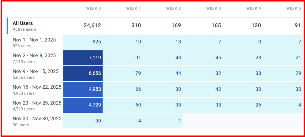
Now let’s discuss how to do this inside Google Analytics (GA4 version).
Note: GA4 supports cohort exploration natively.
Step 1: Go to Explorations
- Login to GA4
- Click Explore
- Select Cohort Exploration
Step 2: Configure Cohort Settings
You’ll see configuration panel:
Cohort Inclusion
Choose event:
- first_visit
- first_open
- purchase
- custom event
This defines your acquisition cohort.
Return Criteria
Select what counts as return:
- Any event
- Specific event (e.g., purchase)
- session_start
Cohort Granularity
Choose:
- Daily
- Weekly
- Monthly
For SaaS → Monthly
For mobile apps → Weekly
For campaigns → Daily
Calculation Type
Choose:
- Standard retention
- Rolling retention
Standard retention: User must return exactly in that period.
Rolling retention: User returns in that period OR any future period.
Step 3: Interpretation
You’ll see:
Rows → Cohort by date
Columns → Time intervals
Cells → Retention %
Similar to Excel cohort table.
Step 4: Revenue Cohort in GA4
In Explorations:
- Add Metric → Total Revenue
- Change view from User Retention to Monetization
This allows cohort revenue tracking.
Step 5: Segment by Channel
You can add breakdown dimension:
- Session default channel group
- Source / Medium
- Campaign name
This allows analysis like:
- Organic search cohort
- Paid ads cohort
- Social media cohort
Very powerful for performance marketing.
When Should You Use GA4 vs Excel?
Use Excel when:
- You want full control
- You need custom LTV formulas
- You want CAC comparison
Use GA4 when:
- You want automated tracking
- You track website/app events
- You need quick visual insights
Business Applications of Cohort Analysis
- SaaS Companies: Track subscription renewal rates.
- E-commerce: Measure repeat purchase behavior.
- Mobile Apps: Monitor uninstall and engagement patterns.
- EdTech Platforms: Track student course completion rates.
Common Mistakes in Cohort Analysis
- Using inconsistent time intervals.
- Comparing incomplete cohorts.
- Ignoring sample size.
- Not segmenting by acquisition channel.
- Confusing retention with engagement.
Heatmap Representation
In practice, cohort tables are displayed as heatmaps:
- Darker colors = higher retention
- Lighter colors = lower retention
This helps identify trends visually.
Practical Interpretation Strategy
When analyzing a cohort table, ask:
- Does retention improve over time?
- Did a product update improve newer cohorts?
- Which month shows the highest churn?
- Are marketing channels affecting quality?
Real-World Scenario
Suppose a SaaS company launches a new onboarding flow in March.
Comparing:
- January retention = 40% in Month 3
- March retention = 36.6% in Month 3
Conclusion:
New onboarding did not improve retention. Further analysis required.
Cohort Analysis for Strategic Decisions
Cohort analysis helps:
- Improve onboarding
- Optimize pricing
- Increase LTV
- Reduce churn
- Improve retention campaigns
- Identify loyal customer segments
Conclusion
Cohort analysis is one of the most powerful tools in behavioral analytics. Unlike surface-level metrics, it reveals long-term user patterns and strategic insights.
By grouping users into cohorts and tracking retention, churn, revenue, and lifetime value, businesses can make data-backed decisions.
Manual calculations using simple formulas make it accessible even without advanced tools. However, platforms like analytics software and spreadsheets make visualization easier.
If your goal is to understand not just how many users you have — but how well they stay, engage, and generate revenue — cohort analysis is indispensable.
Frequently Ask Questions (FAQs)
What is cohort analysis in simple terms?
Cohort analysis is a method of grouping users based on a shared characteristic—such as signup date—and tracking their behavior over time. It helps businesses understand retention, engagement, and long-term performance instead of just looking at total growth numbers.
Why is cohort analysis important for businesses?
Cohort analysis helps businesses identify retention trends, detect churn patterns, and evaluate marketing effectiveness. It provides deeper insights into customer behavior, enabling better decisions related to product improvements, pricing, and long-term growth strategy.
What is the difference between cohort analysis and traditional analytics?
Traditional analytics focuses on overall metrics like total users or total revenue. Cohort analysis, however, studies specific groups of users over time, making it easier to understand how behavior changes and whether growth is sustainable.
Can cohort analysis be done in Excel?
Yes, cohort analysis can be performed in Excel using structured data, pivot tables, and date grouping. It allows businesses to manually calculate retention rates, revenue trends, and cohort comparisons without requiring advanced analytics software.
How does Google Analytics (GA4) help with cohort analysis?
GA4 provides built-in cohort exploration reports that allow businesses to track user retention, engagement, and revenue trends automatically. It simplifies analysis by visualizing user behavior across daily, weekly, or monthly time intervals.